UX,
User Testing,
Web Development
A failed user test led to an observation that netted us a huge bump in signups.
Highlights
↑ 23% platform sign-ups
↑ 50% onboarding completion
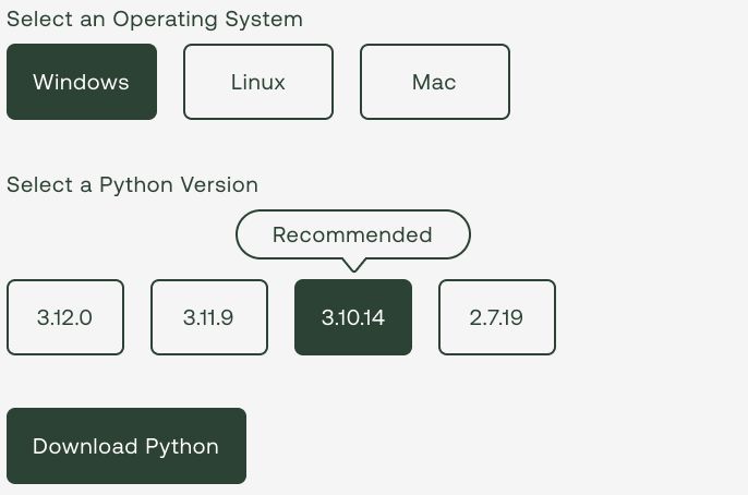
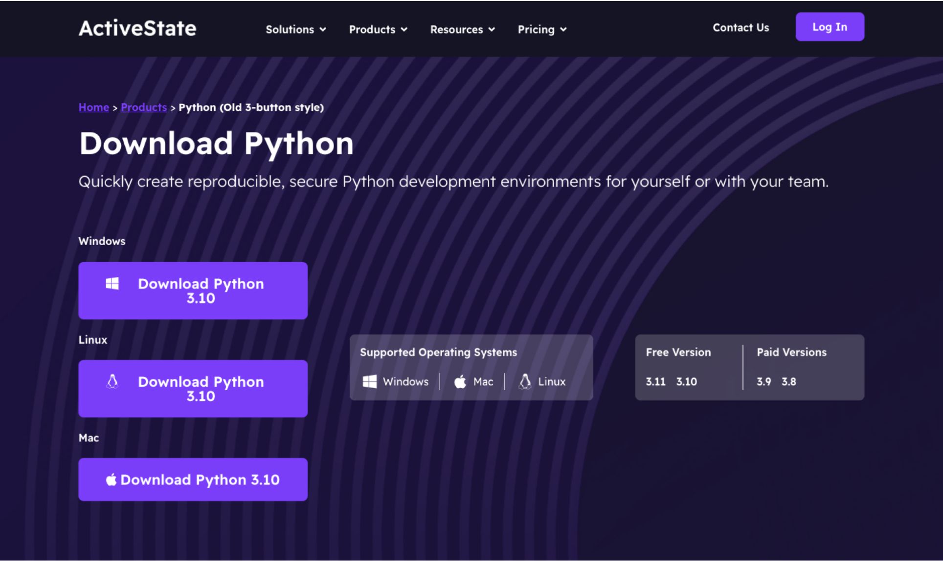
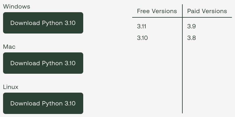
ActiveState's website featured programming language pages with three download buttons: one for each major operating system.
Unfortunately, these buttons lacked unique functionality. All three directed users to the same landing page where they had to confirm their operating system again. This created unnecessary friction in two critical ways:
We needed to fix this by addressing both problems head on:

We focused on the Python language page, targeting the experience for first-time visitors.
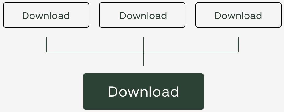
Rather than making sweeping changes immediately, we opted to start with a minimal approach. Our streamlined design featured just one primary button with the supported operating systems llisted adjacent to it.
We hypothesized that implementing a single primary button would significantly reduce friction in the signup flow, ultimately driving a substantial increase in conversions.
Basic UX fundamentals would tell you that reducing unnecessary choices leads to less friction which leads to more conversion. No brainer, right?
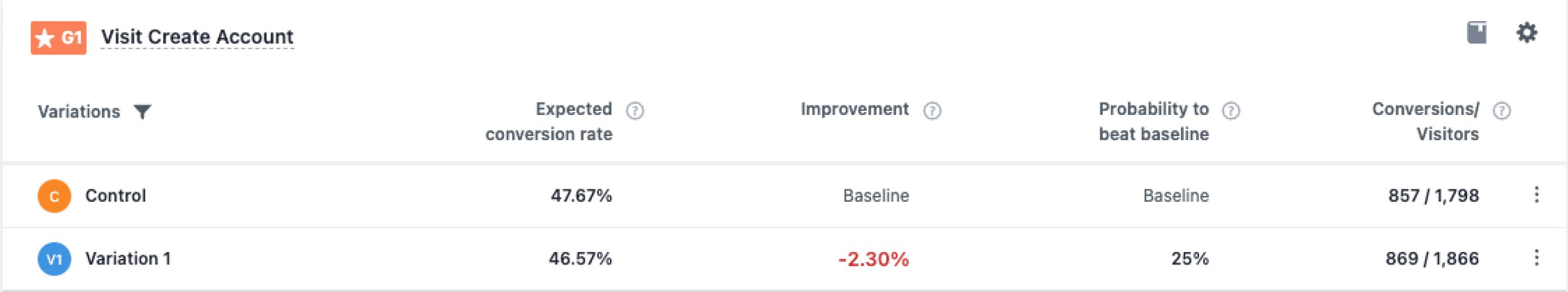
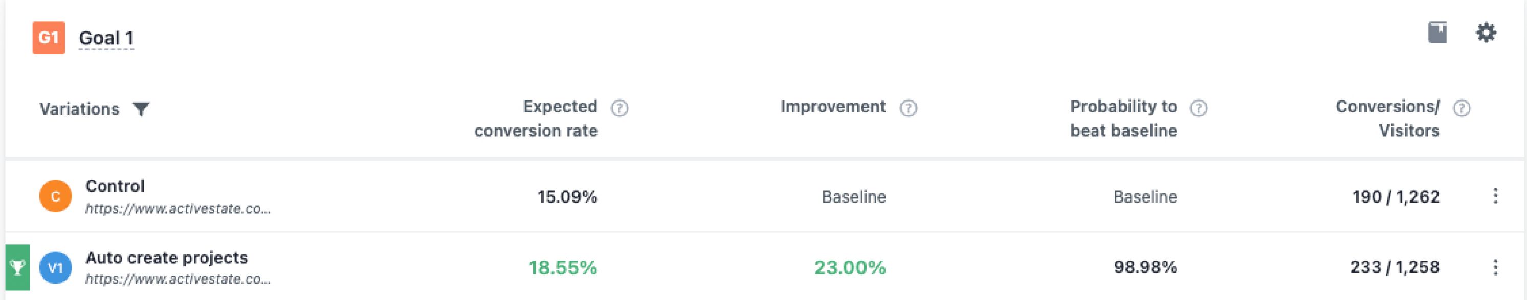
We measured the results twice over a two week period. There was a consistent decrease in completed signups.
What happened? How could having less friction not break even at least? It was undeniably a F.A.I.L. (first attempt in learning).
It was time to regroup and decide on a new plan.
My initial thoughts for the second attempt were simple, and maybe a bit brazen:
“If users didn’t like when we had less buttons, maybe they’d like it if there were more?”
How would we do that meaningfully though?
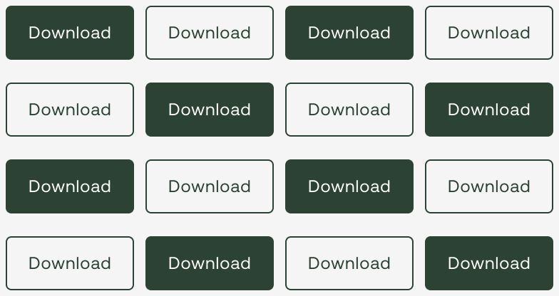
Moving some of the choices a user makes in onboarding to before account creation would reduce friction while adding real functionality to the "fake" buttons on the page.
The new process would look like this:
We achieved this by working with developers, making it so the buttons on the website add parameters to the URL, and are read by the platform after sign-up in order to kick the project creation process off automatically.